

Rethinking How Copilot Surfaces Prompts — A Speculative Design Exploration
- Manuel S. Escobedo
- Apr 3
- 4 min read

Updated: Apr 3
What if the AI assistant already knew what you needed before you typed? Here's how I explored a smarter, more expressive prompt layer for Microsoft Copilot — and what I learned along the way.
⚠️ Disclaimer: This is an independent, speculative design concept. It is not affiliated with, endorsed by, or connected to Microsoft in any way. "Copilot" is a registered trademark of Microsoft Corporation. All UI designs are original works created for portfolio and learning purposes only.
Why I started thinking about this
There's a moment every Copilot user has experienced: you open the app, see the same four suggested prompts you've seen every day for the past month, and either type something from scratch or close the tab.
That friction is small. But in enterprise software used by thousands of people every day, small friction compounds fast.
I've spent time designing AI-powered features for M365 products, so I know how hard the challenge is from the inside. But I also believe that the prompt layer — the surface between a user and the model — deserves just as much design care as the model itself.
So I decided to explore it as a personal side project. No client brief, no stakeholder reviews. Just a design question I couldn't stop thinking about:
What if Copilot's suggested prompts actually knew who you are and what you're working on?
The problem with static suggestions
The current Copilot home screen has a lot going for it. Clean layout, familiar patterns, solid Fluent design language. But the prompt suggestions are generic by default — the same cards for everyone, regardless of your role, your calendar, or your recent activity.
This creates a few real usability gaps:
Discoverability is limited. If you can't see it, you don't know it exists. Four static cards barely scratch the surface of what Copilot can do.
There's no personalization signal. Microsoft already has access to rich behavioral data through M365 — calendar, email, Teams activity. Almost none of that intelligence surfaces in the prompt layer.
The interaction is flat. Selecting a prompt and sending it feels like clicking a link, not starting a conversation.
These aren't fatal flaws. But they're meaningful opportunities.
What I explored
I built a Figma prototype that focuses on one specific surface: the prompt layer on the Copilot home screen. Four interaction states, connected by intentional motion.


State 1 — The home screen
The starting point keeps what works: the soft lavender gradient, the centered greeting, the familiar shell. But the prompt cards extend horizontally, with the fourth card clipped just enough to signal there's more to explore. Horizontal scroll replaces a static grid — making prompt discovery feel gestural and lightweight, like browsing rather than choosing from a menu.
Below the input field, a "Customize prompts" link gives users explicit control over what they see.
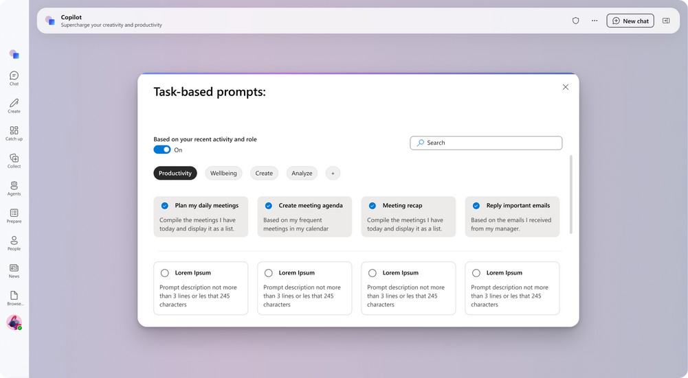
State 2 — The customize modal
This is where the behavioral intelligence becomes visible.
The modal opens with a toggle: Based on your recent activity and role. When it's on, Copilot surfaces prompts ranked by your role, calendar patterns, recent M365 activity, and email behavior. The top row shows AI-suggested prompts (pre-checked). The bottom row shows a browseable library of additional prompts the user can add to their shortlist.
Category filters — Productivity, Wellbeing, Create, Analyze — let users self-identify their current mode. A search bar covers edge cases.
The design principle here: show the system's intelligence first, then let the user override it. This builds trust in the personalization model rather than hiding it behind a settings screen.

State 3 — Prompt-to-input fill
This is the micro-interaction I'm most proud of.
In the current experience, clicking a suggested prompt takes you into a new chat with that text pre-filled. In this concept, clicking a prompt populates the input field in place — the text animates in, the field expands, and a contextual toolbar appears: attach content, mention someone, send. The border shifts to a deep violet, signaling that the input is now active and ready.
The result: the gap between selecting a prompt and sending a message collapses to almost nothing. One tap, and you're already in the flow.
State 4 — Chat mode
Once a conversation starts, the layout transforms. The greeting disappears. The main area becomes a clean conversation canvas. The input migrates to the bottom of the screen — following the mental model of messaging apps users already know.
Here's the subtle detail I loved most: the input border shifts from violet (discovery mode) to pink/coral (conversation mode). No label, no tooltip. Just a color signal that tells returning users — subconsciously — that they've moved from browsing into talking.
What I'd measure if this shipped
Good design thinking includes success criteria. If this concept were real and we were preparing for a pilot, I'd want to track:
Prompt card CTR — click-through rate on suggested prompts versus the current static card baseline
Time to first send (TTF) — how long it takes users to go from landing on the home screen to sending their first message
Favorites retention — whether users who customize their prompt shortlist maintain it across sessions (a signal that the personalization model is surfacing genuinely useful prompts)
What I learned
A few honest takeaways from this exploration:
Behavioral data is a design asset, not just an engineering one. M365 already knows a lot about how people work. The design opportunity is in making that intelligence legible, controllable, and trustworthy — not hidden in a settings panel.
Motion can carry meaning. The input border color shift between states is a tiny detail. But it's the kind of detail that, at scale, teaches users how a product works without them realizing they're being taught. That's the goal.
Speculative work keeps your instincts sharp. This project didn't come with a client brief or a deadline. It came from a genuine itch I couldn't leave alone. And it's some of the most honest design thinking I've done in a while — because the only person I had to convince was myself.
Try the prototype
You can interact with the full prototype here: 👉 View on Figma


Comments